Straight to work・AI worked about 15 min
Give the details and the feel in one go, then build the home page
Member
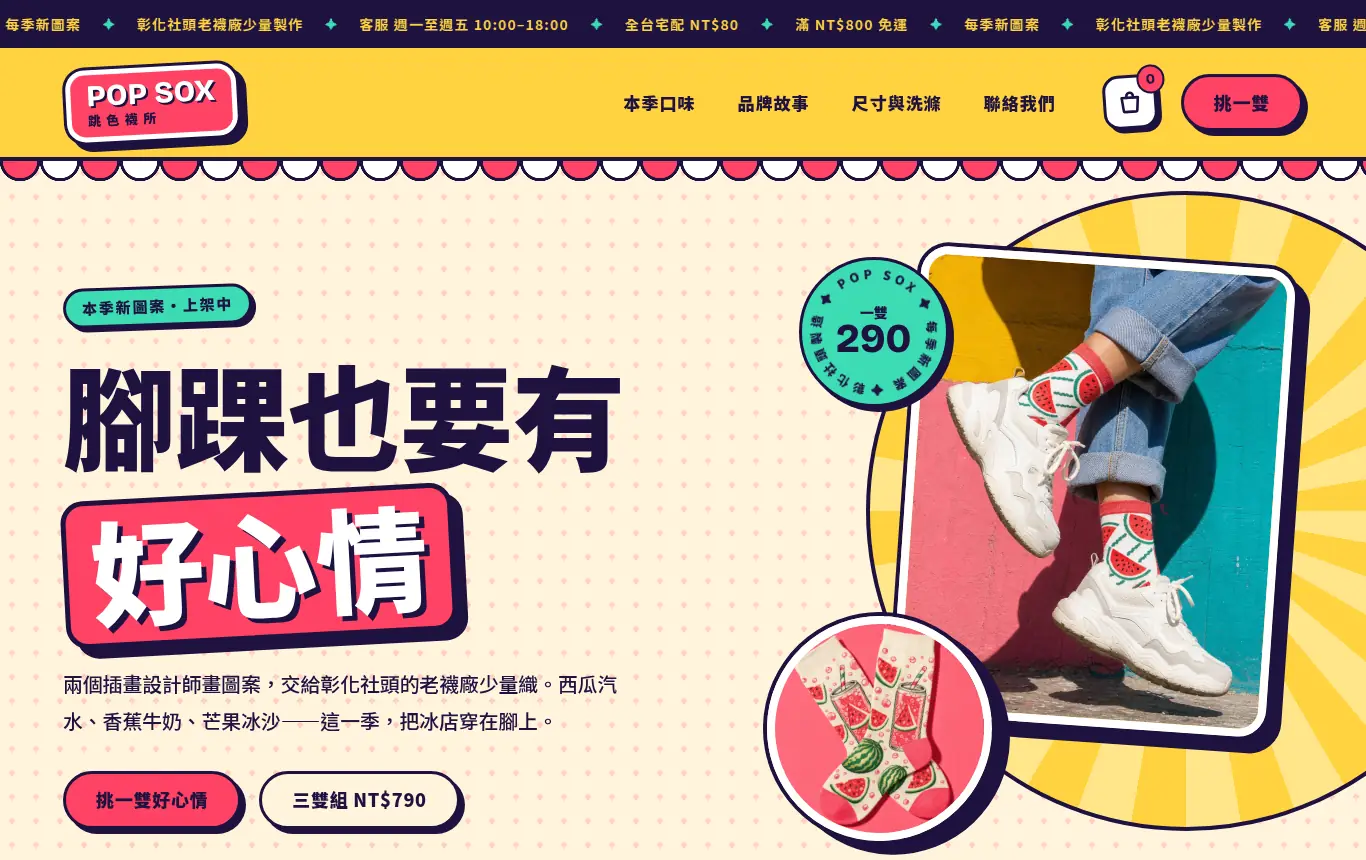
Hi! We're POP SOX, an original-print sock brand, and we want to use this WordPress site as our brand site and online store. Brand story: two illustrators design the prints together, and an old sock mill in Shetou, Changhua (Taiwan's sock capital) makes them in small batches. We launch new prints every season. Tagline: "Even your ankles deserve a good mood." Products: Watermelon Soda Socks NT$290, Banana Milk Socks NT$290, Mango Smoothie Socks NT$290, Color Pop 3-Pack (one pair of each) NT$790. Customers: young people aged 18–35 who love putting outfits together and sharing photos. No physical store, online only. Phone 02-2345-6789, email [email protected], customer service Mon–Fri 10:00–18:00. No logo. I want the style to be bold, with clashing pops of color: like the signs at a summer shaved-ice shop and street stickers. The colors can be loud, with lots of them used together, and the type should be big and fun, but it still has to be easy to read and easy to buy from. Not minimalist, not grayish, and not the white-background, blue-button look of a typical online store. You decide the design direction. Build the home page, header and footer first; once I've seen them and like them, we'll do the other pages.
Done: 7 actions
- Set site name and tagline
- Install Elementor
- Design concept: "Ice Shop Signs × Street Sticker Wall"
- Generate 8 product and street-style photos with AI
- Write its own layouts and site-wide styles
- Site-wide header, footer and menu
- Screenshot desktop and mobile
Roamer AI
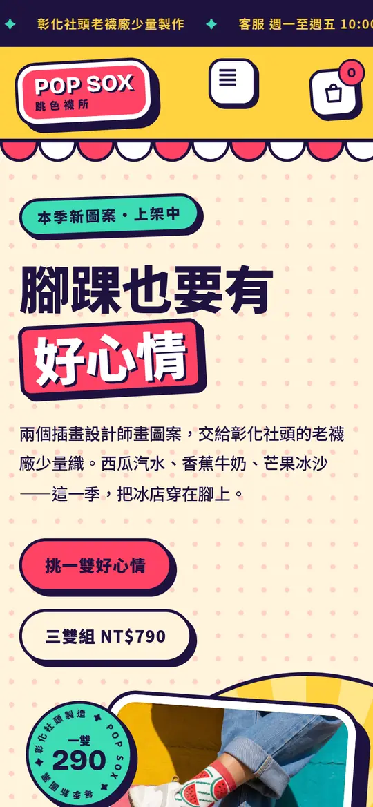
The home page and the site-wide header and footer are done and live. The design concept is "Ice Shop Signs × Street Sticker Wall": the logo, product cards, buttons and prices all have thick outlines and crisp, hard-edged shadows, and they're stuck on slightly crooked on purpose. Hover over one and it snaps straight. Below the header and above the footer runs the scalloped edge of an ice shop's red-and-white awning. The palette is drawn from the three flavors: watermelon red, banana yellow and mango orange, plus soda mint and soda blue, on a cream background. No grayish white, and no blue buttons.
Prompt tip
You can cover everything in your very first message: paste in your brand, products and prices, contact details and the feel you want, then end with "You decide the design direction; build the home page first and show me." It gets straight to work, with no back-and-forth first.